Triangle Pest Control
BRANDING
Internship
CoalmarchBrief
To redesign a local pest control companies logo, Tirangle Pest Control.The issue they saw in the their original logo was that the T in the whitespace of the logo was not noticable enough to them and their clients. So the primary goal was to keep the same look and feel of the original logo, but emphasis the T in a better way.

Original Design
This is an example of the original logo Triangle Pest Control used for their company.
First Itterations
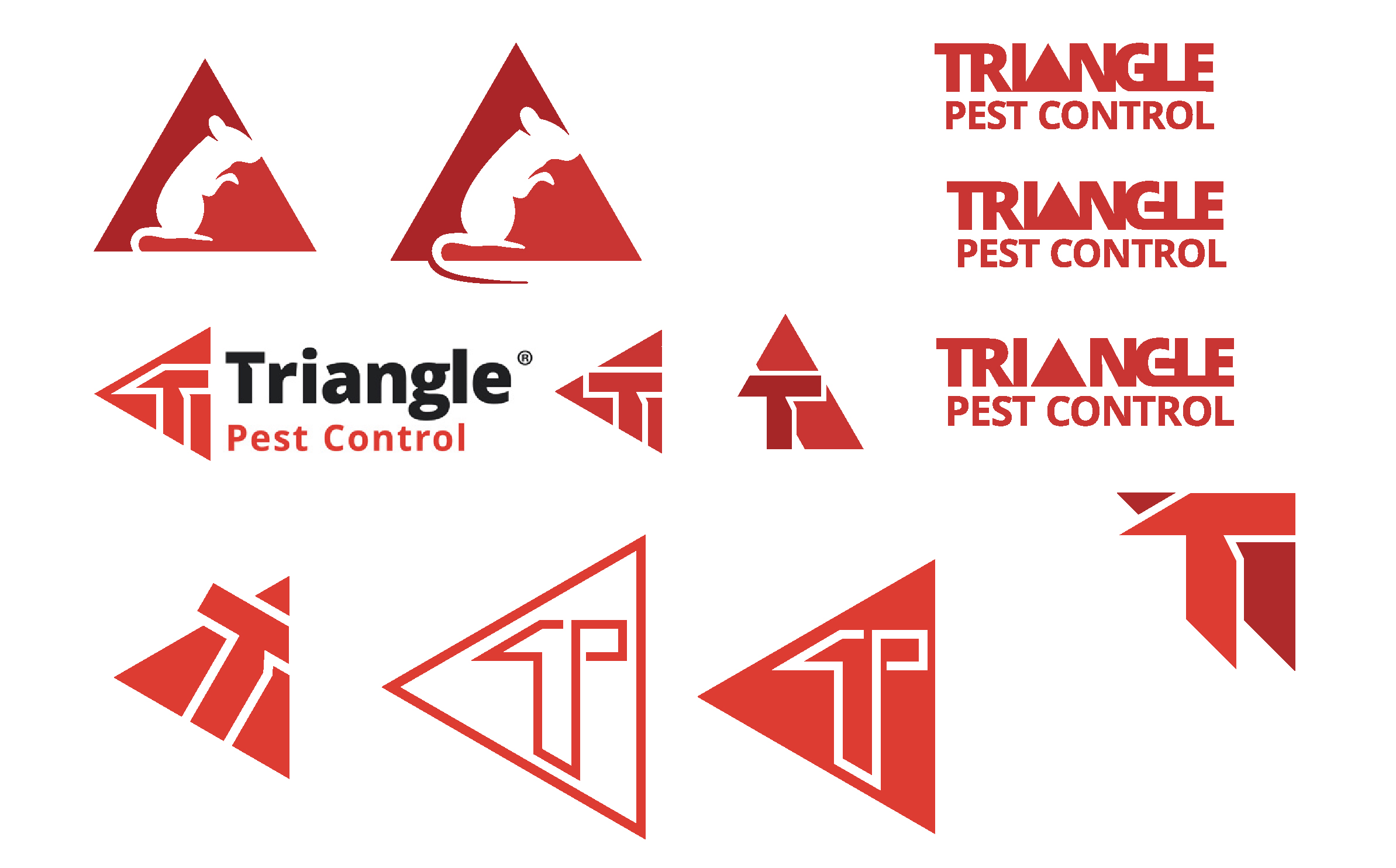
These are my first itterations into the redesign of the original logo, keeping the same form as the original but trying to emphasive the Tmore legibly.

Different Styles
This is my exploration into different styled logos, moving away from the original form


Proposals
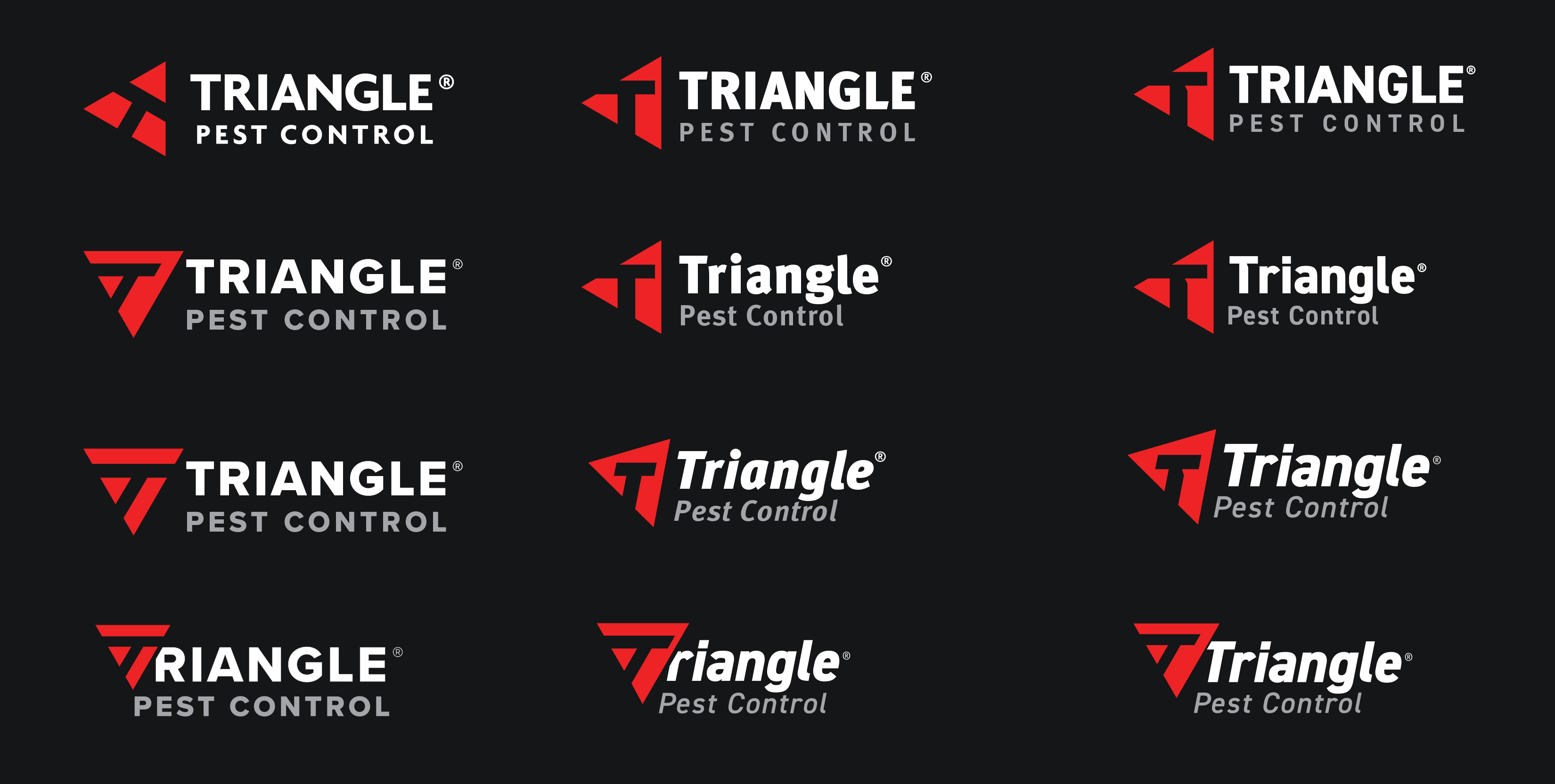
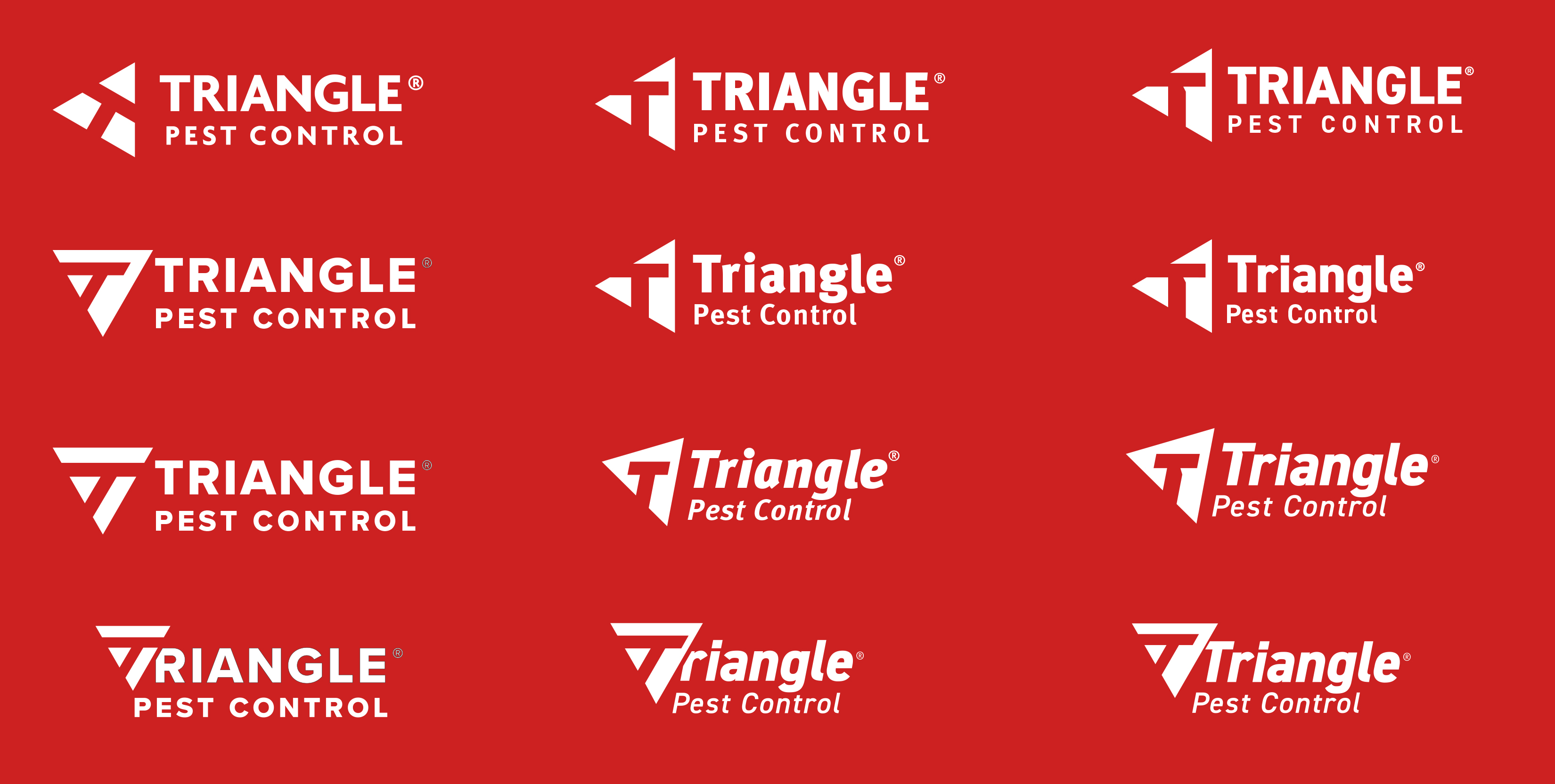
Layout of the final designs that were sent to the client. In the 3 different color versions that they commonly use.


