
BOOOOP
COLLEGEUX
BRANDING
ACCESSIBILITY
TEAMMATES
Joseph RogersKennedy Liggett
Rachel Thomas
PROJECT BRIEF
Observe a space in Raleigh and identify a problem in the space. Then propose and create a design intervention for the problem.CONCEPT
Playgrounds are meant to be fun, safe, and inclusive areas for all children and families to enjoy. Pullen Park is one of Raleigh’s top attractions, and for many families, a fun and relaxing space. However for children with autism, crowded and active parks such as Pullen Park are highly uncomfortable, or even unbearable. BOOOOP is an interactive mapping system that strives to prepare autistic children for the many unexpected sensory experiences at Pullen Park.
Autism is a spectrum disorder, which means that autism consists of a very wide range and severity of symptoms. Essentially, every autistic person is unique, which is why it is hard to inclusively design for those on the spectrum. In order to make sure our design catered to everyone on the spectrum, we created our design around two main personas: one who is hypersensitive to sound, and another who is on the opposite end of the spectrum and hyposensitive to sound.
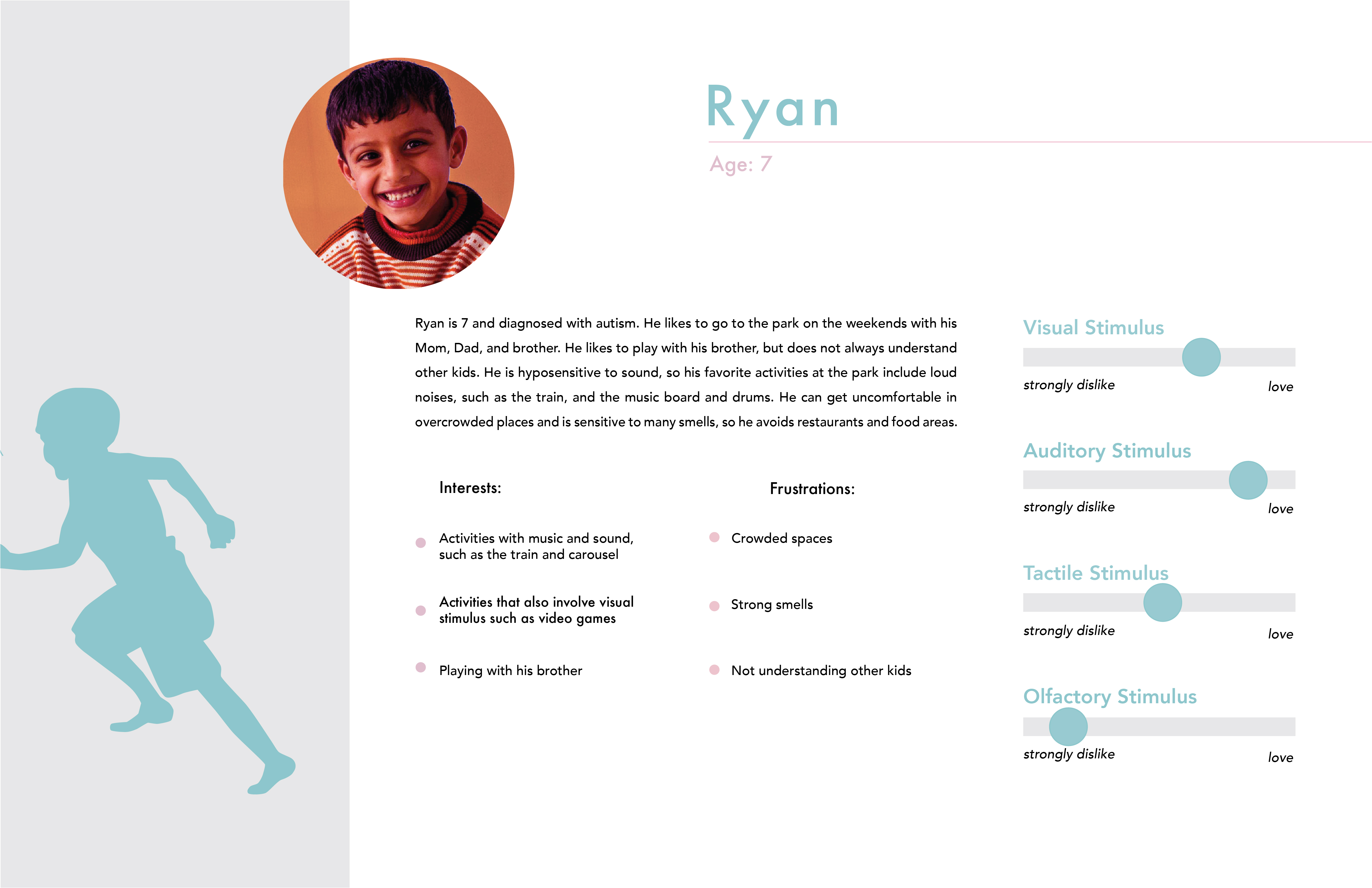
Ryan is hyposensitive to sound, which means that his senses of sound are muffled. Because of this, he enjoys activities that create noise because he doesn't get to experience sound in the same way most of us do.
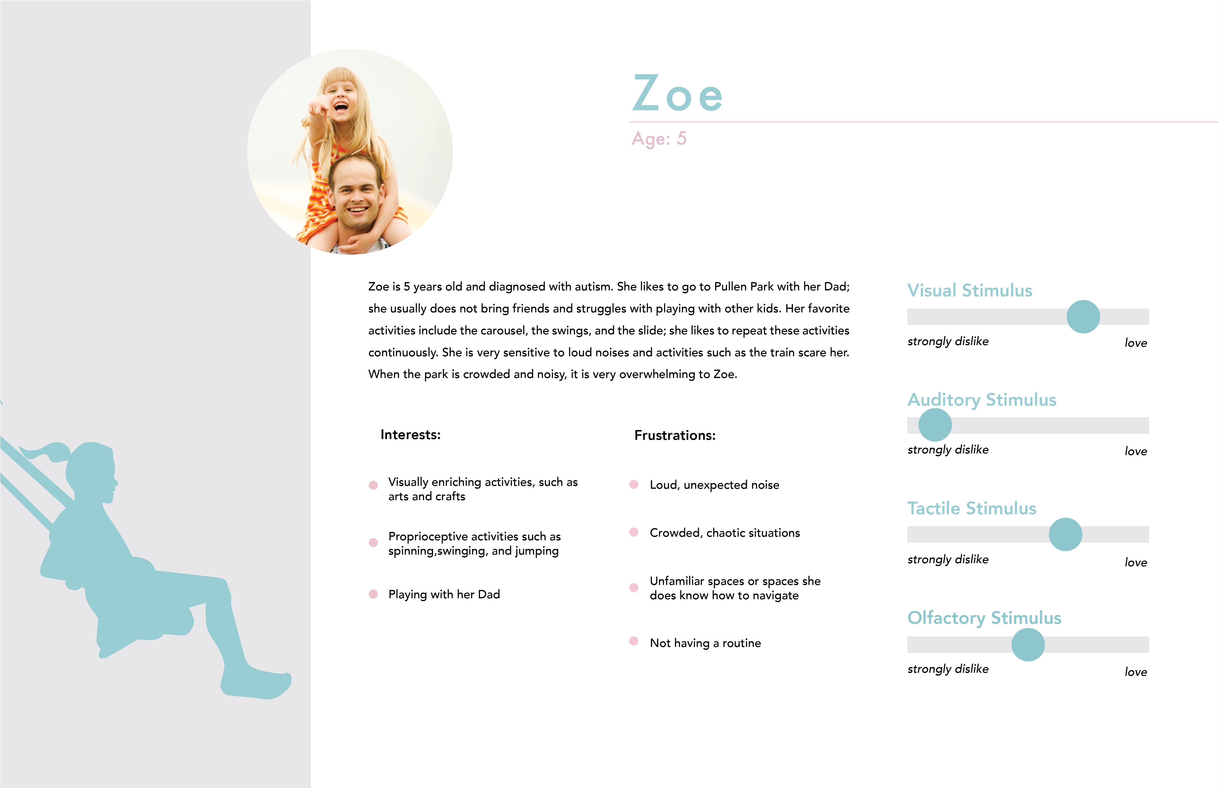
Zoe is hypersensitive to sound, which means that she becomes easily overwhelmed by sound and has trouble filtering the sounds around her. For Zoe's user journey, we felt it was important to include a good and bad day because with autism, not every day is going to be perfect, and we wanted to illustrate how our design can help create a good day, or help mediate a bad one.

It was important that our design not isolate kids with autism. Autism can be isolating enough, so we didn't want to create a design that further isolated kids with autism and made them stand out. Because of this, it was our goal to create a design that every kid could enjoy.

Map of Pullen Park that illustrates the zones and the sounds that can be heard within those zones. Additionally, there are icons on the map that show children where they may encounter olfactory, visual, and tactile sensory input. This map would be painted on the ground at the main entrance of the park and be found on boards at two additional entrances. The colors of the zones correspond to how active that area is. Also, the colors were chosen with autistic people in mind. People with autism love color, but if colors are too bright they will become overwhelmed. For that reason, we chose softer, muted colors for our zones (with pink being the most active area and purple the least)

Images of each station’s board and accompanying jump pad.
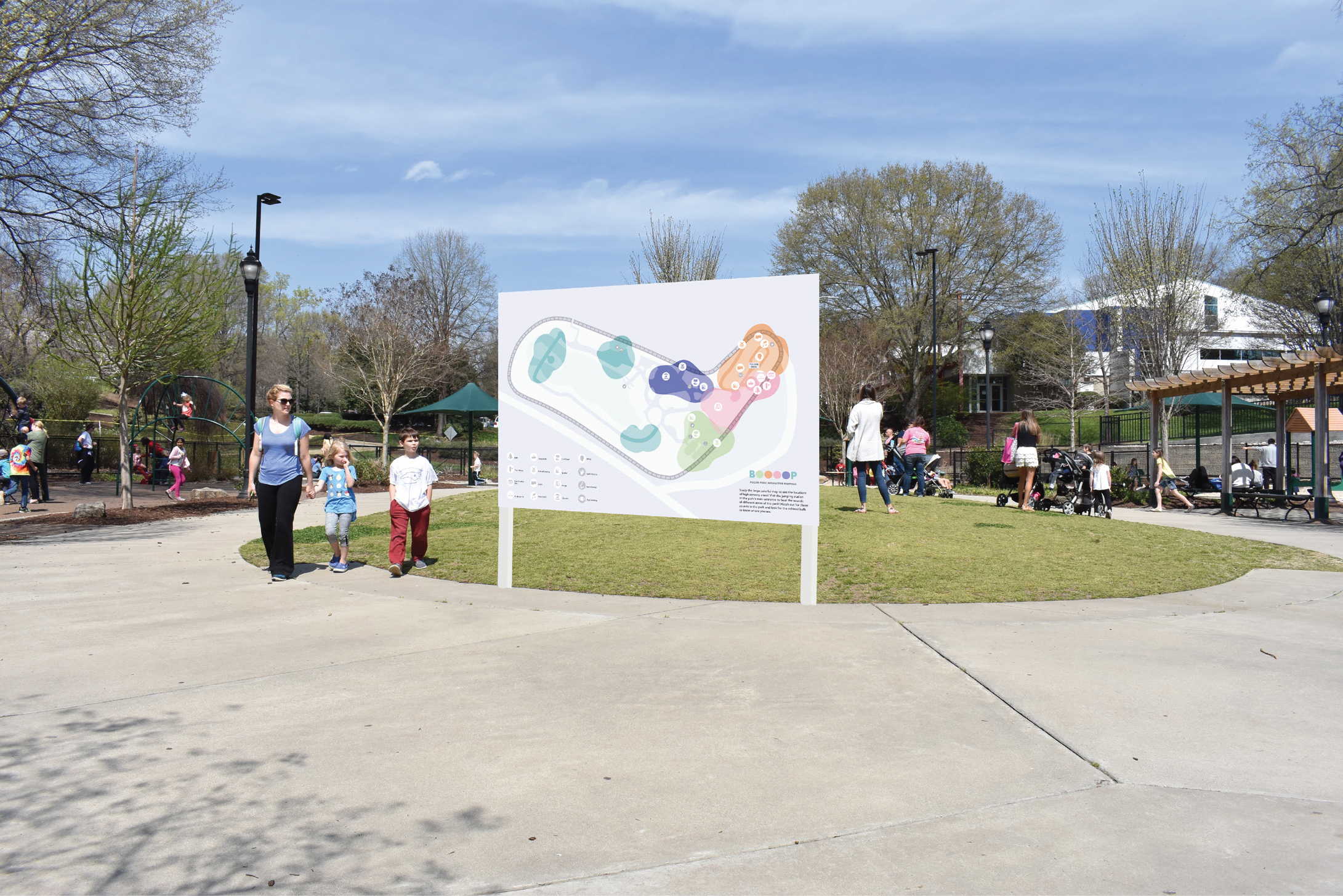
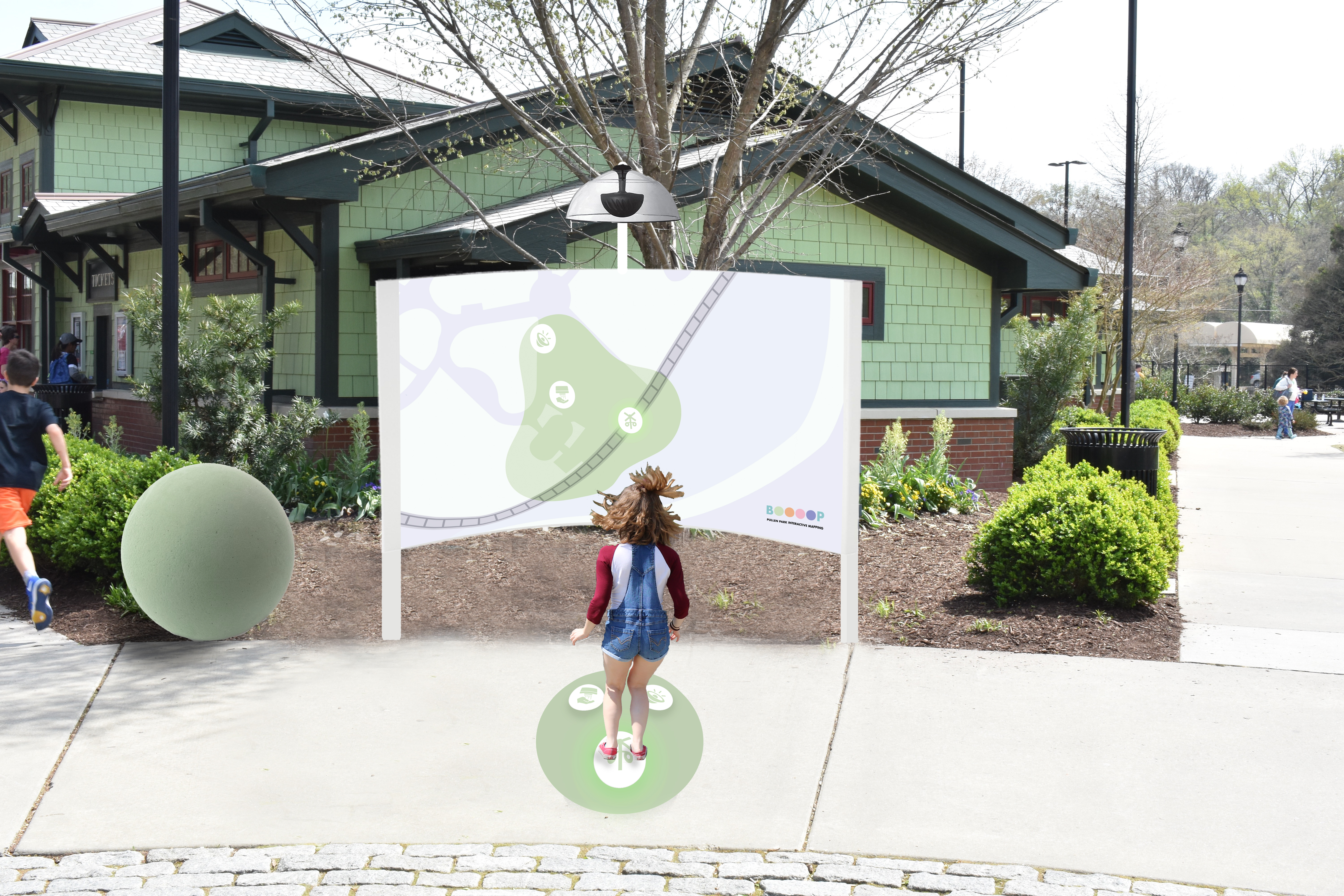
There are two additional entrances to the park besides the main one. There would be a board located at both of these entrances that contains the map of Pullen Park, along with the zones and sounds within them. The board would also contain a key that labels what each icon represents and brief instructions on what BOOOOP is and where visitors can go to interact with it. Here is an example of what one of these boards would look like and where its potential location would be.
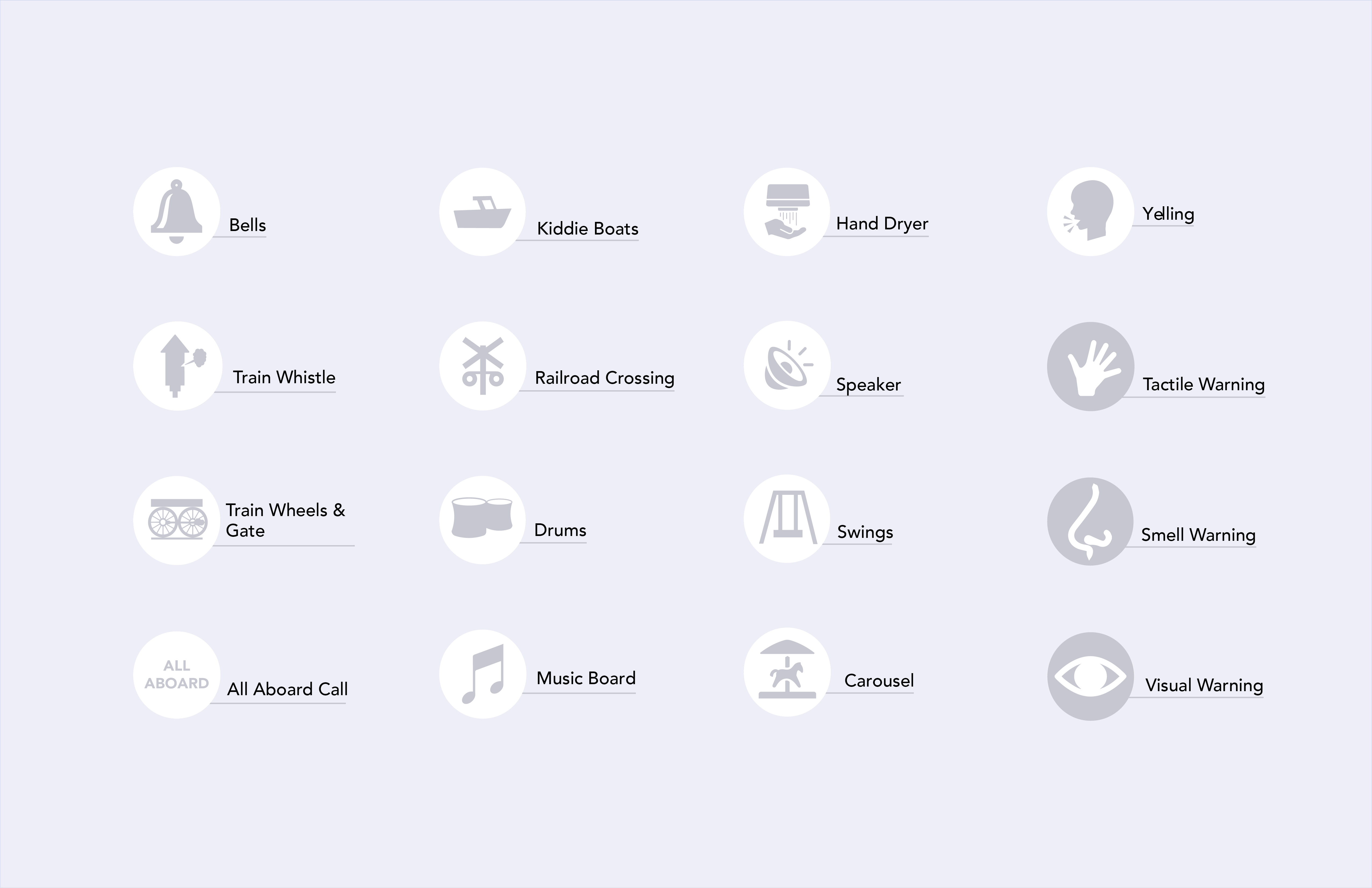
Icons for sounds throughout Pullen Park that could overwhelm a child with Autism.
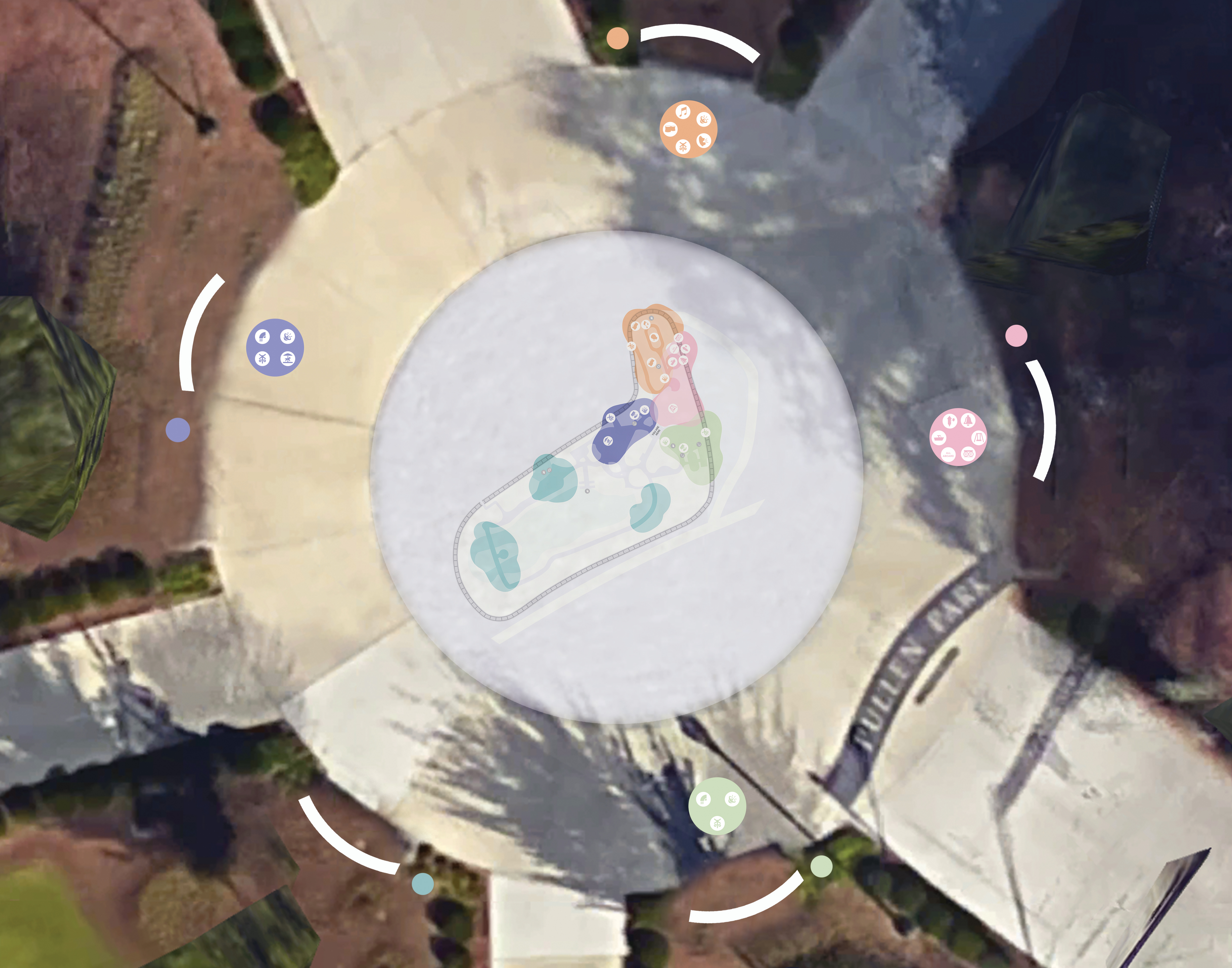
BOOOOP is located in the entrance of the park so that is easily visible to guests as the enter. Stations are spaced throughout the circle so each child has a more individual experience. Each station is located in relation to the map on the ground and the zone’s location within the park. In the middle of the circle is a map of Pullen Park with all of the zones and the sounds that can be heard within them.

We imagine that this map would serve as a resource for parents while their child plays on the interactive jump pads. People can also use the map on the ground as reference when interacting with the individual boards.

Image of the board for the green zone. Each station will contain a board that highlights a specific zone within the park, along with icons of the sounds that can be heard within that zone. It is common for children with autism to get distracted and overwhelmed easily, so each station was designed to better alienate distractions and create an individual experience for the child. The boards that contain the zones are 7 feet wide by 5 feet tall. This was done to reduce the amount of distractions a child can see, blocking out the majority of the park so that the child can fully focus on BOOOOP. Additionally, kids with autism can become overwhelmed by those around them. To solve this, the boards are designed to slightly curve around the child, giving them a sense of safety and a more individual experience.
Each station contains a map of a specific zone within the park, a jump pad with buttons that match the icons found on the map, parabolic speakers, and a rubber ball that matches the color of the zone. When a child jumps on one of the buttons on the jump pad, he/she will hear the sound that accompanies that button. For example, if the child jumps on the icon of a train whistle, he/she will hear the train whistle. Additionally, there are balls located within the park that match the colors of the zones to help people identify what zone of the park they are in.
When a child jumps on the pad, the sound of the icon they jumped on will be emitted from the parabolic speaker on top of the board. Due to autistic children’s sensitivity to auditory input, we didn’t want a child with autism to become overwhelmed by the sounds of other kids interacting with BOOOOP, so parabolic speakers were placed on each board to direct the sounds towards the person directly interacting with the board.
When a child jumps on the pad, the sound of the icon they jumped on will be emitted from the parabolic speaker on top of the board. Due to autistic children’s sensitivity to auditory input, we didn’t want a child with autism to become overwhelmed by the sounds of other kids interacting with BOOOOP, so parabolic speakers were placed on each board to direct the sounds towards the person directly interacting with the board.
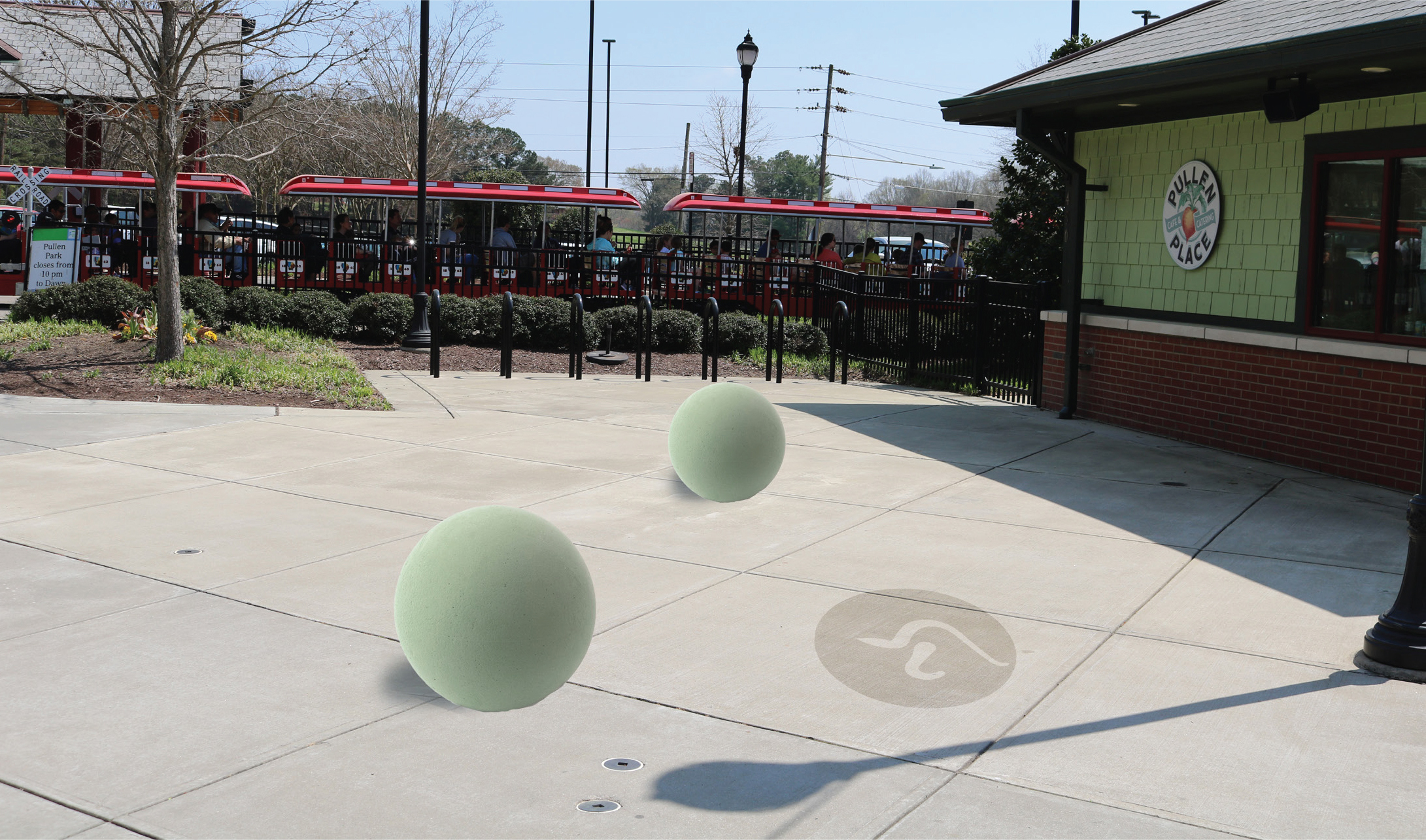
These are balls located within the green zone that would inform people of the zone they are in and what sounds they will hear there. When designing the balls, we wanted to create a navigational system that would be understandable to kids, but also act as a playful addition to the park. And due to their height, they serve as both. The balls are easily recognizable to kids as they navigate throughout the park because they are lower to the ground, much like a child, but they also provide an opportunity for children to crawl on top of them as well. Additionally, the nose icon on the ground mirrors the one on the larger map and informs visitors that the area they are entering contains olfactory input that a child with autism may be overwhelmed by.

If a child gets overwhelmed at any point during their time at the park, we wanted to inform them of areas they could go to de-stress. The calm board highlights three areas of the park that are located near water, which helps children with autism de-stress, and separated from the majority of activities at the park. Along with highlighting these areas, the board also shows pictures of these areas so people can better locate them. Additionally, the calm board utilizes the color blue because it is a color that many autistic children find soothing.
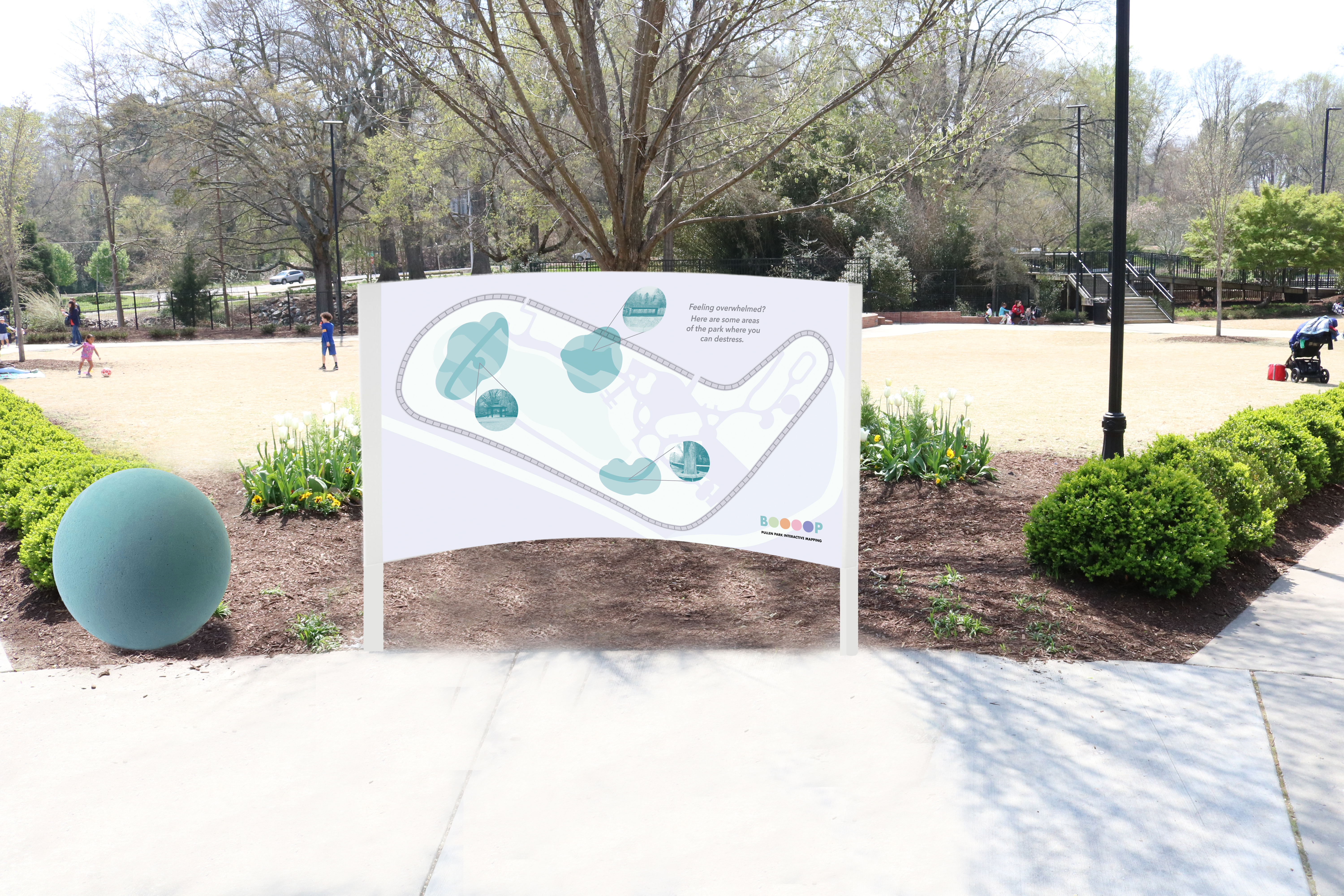
The calm station contains a board highlighting low-sensory input areas, a small key informing visitors on what BOOOOP is and what the icons on the large map represent, and a blue ball that matches the other blue balls located in the calm areas throughout the park.
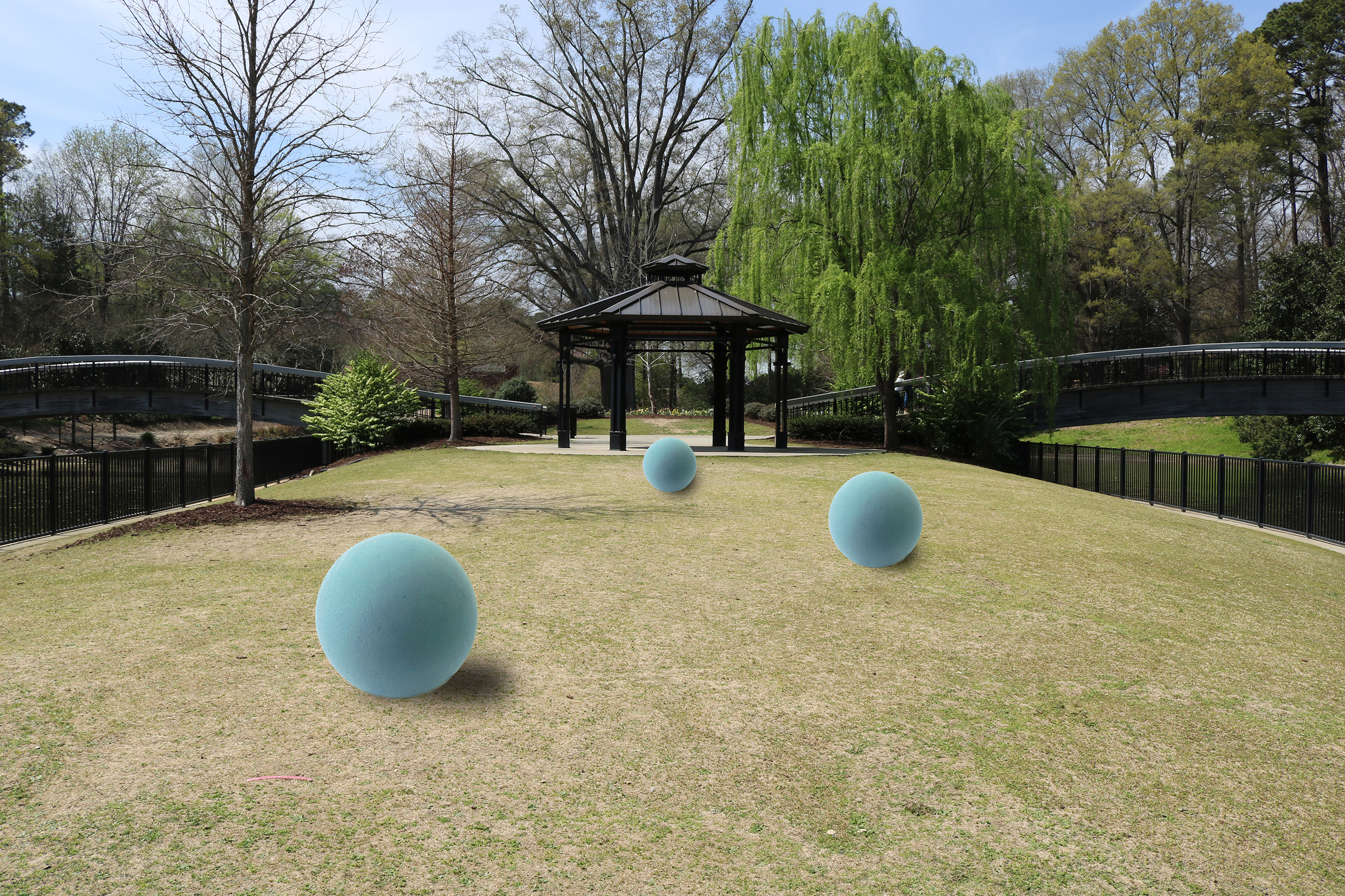
Blue balls are located within the calm areas so that visitors can better identify what areas are low-sensory input areas. The balls also allow the areas to be identified from a distance.

The dots on this map represent where we would place the balls throughout the park in relation to their zone.